Skip to content
espt

Add to your Home Screen

  1. Tap the Share button in Safari's toolbar.
  2. Scroll down and tap Add to Home Screen.
  3. Tap Add. The generator opens full-screen and works offline.

Cursive Alphabet: Letters A to Z

The cursive alphabet is the joined, flowing form of the letters, written in one continuous pen movement. Pick a letter to see how to write its capital and lowercase forms stroke by stroke, how it joins its neighbours, and a practice sheet you can print.

By Maya Chen, lettering designer and type educator · Checked by Jordan Hale · · How we review content

Key facts

  • Cursive letters are easiest to learn in four stroke families (undercurve, loop, downcurve and overcurve), not in A to Z order.
  • Handwriting paper marks four heights: the top line, the dashed midline, the baseline and the descender space below it.
  • A slant of about 15 to 20 degrees to the right is typical for cursive handwriting.
  • Several capitals do not connect to the next letter: O, V and W end high, and in many school models B, D, F, G, I, P, Q, S and T are followed by a pen lift, so lifting the pen there is correct.
  • Every letter page has a Print sheet button that makes a one-page worksheet, sized for US Letter and A4 paper.

The cursive alphabet has 26 capital letters and 26 lowercase letters. The lowercase letters fall into four stroke families: undercurve (i, t, u, w, r, s, p, j), loop (e, l, h, k, b, f), downcurve (a, d, g, o, c, q) and overcurve (n, m, v, x, y, z).
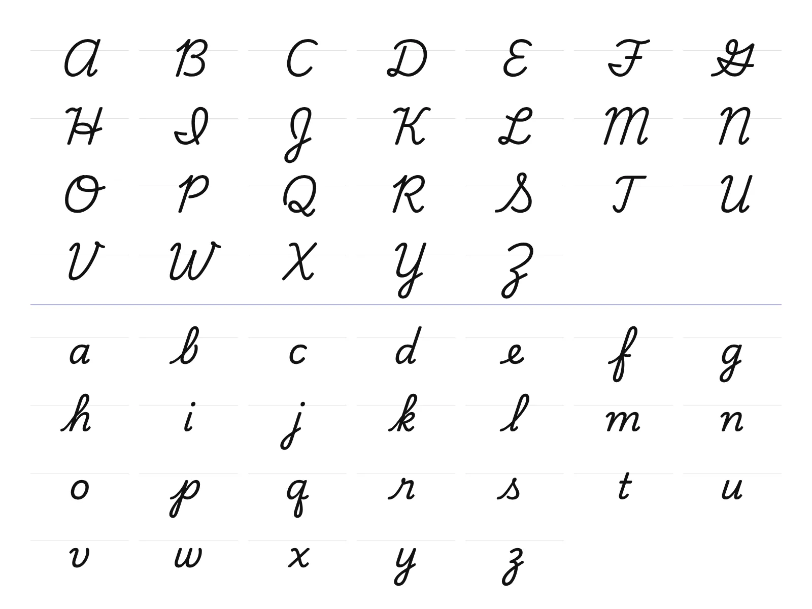
Chart of the cursive alphabet showing all 26 capital letters and all 26 lowercase letters on handwriting guide lines.

Printable cursive alphabet chart

The chart below puts all 26 capitals and all 26 lowercase letters on one portrait page, each in its own box with faint guide lines. It is sized for a full sheet of paper, so you can print it and keep it beside your practice sheets.
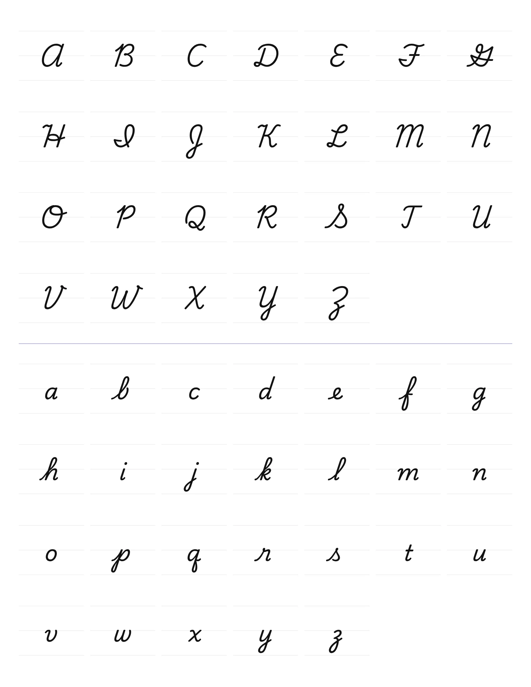
Printable cursive alphabet chart on a single portrait page: 26 capital letters above and 26 lowercase letters below, each in a boxed cell with faint guide lines.

For lined trace-and-write pages, see the cursive worksheets. Each letter page above also has a Print sheet button that makes a one-page worksheet for that letter.

Learn the cursive alphabet in families, not A to Z

The alphabet order is a poor order for learning cursive. Lowercase cursive is built from four basic beginning strokes, and letters that share a stroke are easiest to learn together:

Family Beginning stroke Letters Practise first
Undercurve A curved stroke swinging up from the baseline i, t, u, w, r, s, p, j i, u, t
Loop An undercurve that keeps rising into a tall loop e, l, h, k, b, f e, l
Downcurve Starts at the midline, curving left like a c a, d, g, o, c, q c, a, o
Overcurve A hump that rises and curves over to the right n, m, v, x, y, z n, m

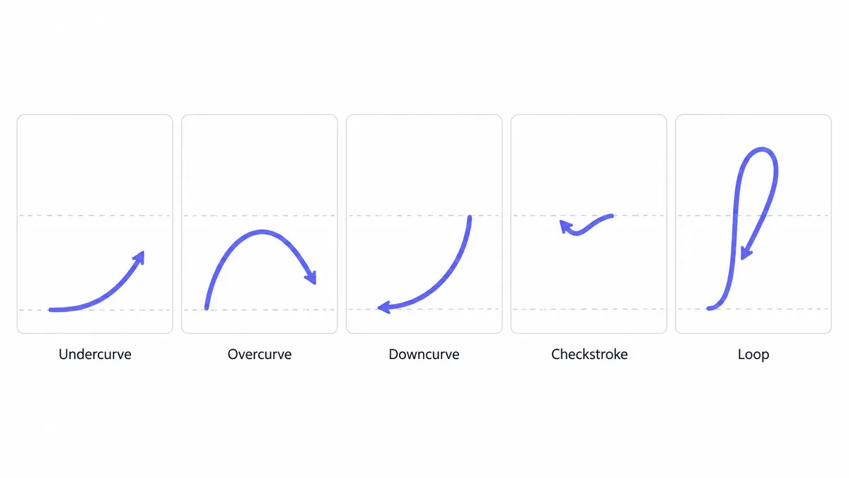
Five basic cursive strokes drawn as arrows on guide lines: undercurve, overcurve, downcurve, checkstroke and loop.

Once a family’s beginning stroke is automatic, every letter in it is mostly the same movement with a different ending. That’s why teachers introduce i, u, t before a, b, c.
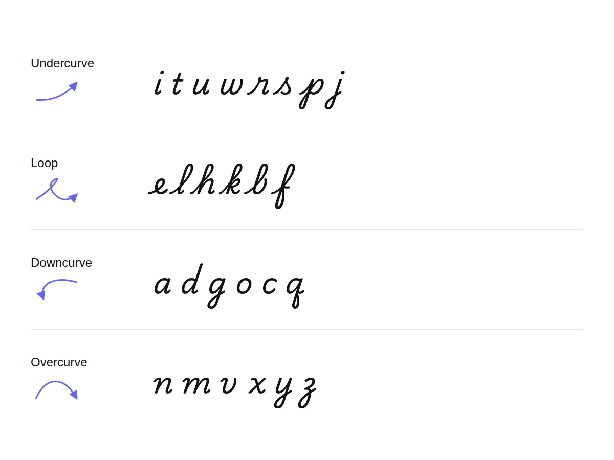
Four rows showing the cursive letter families, each with its starting stroke and the lowercase letters that share it.

What are the four lines that make cursive neat?

Handwriting paper has guide lines for a reason. Each one marks a height your letters should reach:

  • Top line: the height of capitals and tall loop letters (l, h, k, b, f).
  • Midline (dashed): the height of small letters (a, c, e, m, n…).
  • Baseline: where every letter sits.
  • Descender space: below the baseline, for the tails of g, j, p, q, y, z and f.
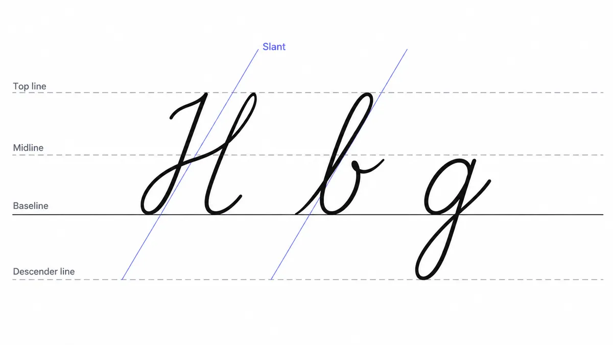
Handwriting guide with four labelled lines (top line, midline, baseline, descender line) and a slanted guide, with three cursive letters sitting on them.

Even letter heights matter more for neat cursive than perfect individual shapes. The practice sheets on each letter page use these lines.
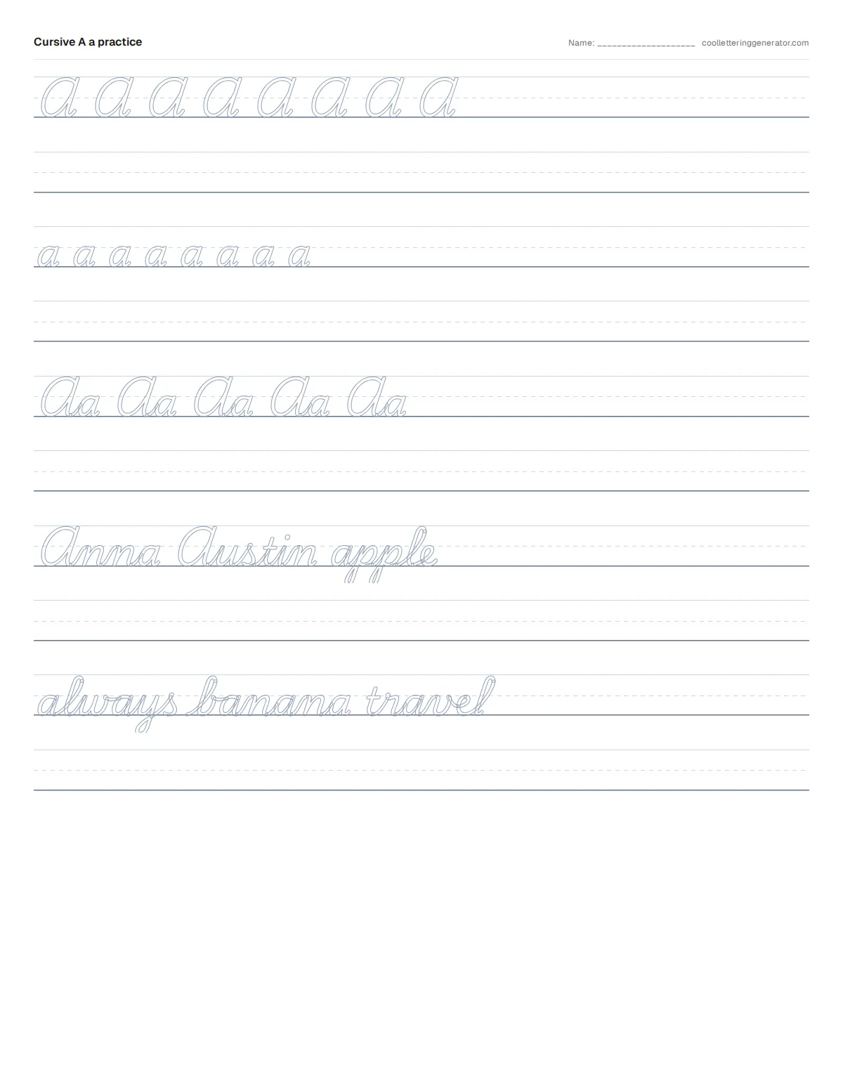
One-page cursive practice worksheet with guide lines, trace rows for the capital, the lowercase and the pair, and practice words.

How do I get a steady slant, spacing and speed?

  • Slant everything the same way. About 15–20° to the right is typical. Turn the paper so your writing arm moves naturally, rather than twisting your wrist.
  • Keep joins smooth, not tight. Cursive letters join with connecting strokes. Leave enough space that each letter is still distinct.
  • Write slowly first. Accuracy builds speed. Rushing early locks in shapes that are hard to unlearn.
  • Lift where the model lifts. Some capitals (O, V, W, and in many models B, D, F, G, I, P, Q, S, T) don’t connect to the next letter. Lifting your pen there is correct, not a mistake.
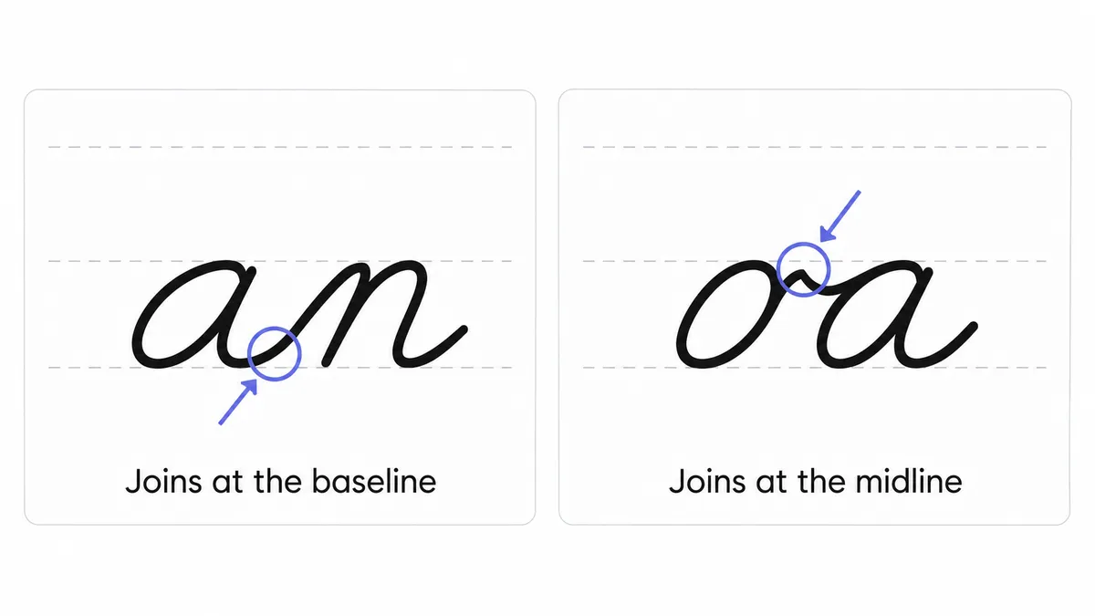
Two cursive word pairs on guide lines showing one join at the baseline and one join at the midline.

Where should I start?

Begin with the family table above, then branch out:

Can I type in cursive instead of writing it?

These guides teach handwriting. If you want cursive-looking letters to paste into Instagram, a message or a design, use the cursive text generator, which builds cursive from Unicode characters. For other ways to get cursive on a phone or in Word and Google Docs, see how to type in cursive. Either way, the cursive letters on these pages are the place to learn the real shapes.

Frequently asked questions

Basics

Which cursive style do schools teach?
In the United States the most common school models are Zaner-Bloser and D'Nealian. Many adults learned the older Palmer method. They share the same basic strokes and joins but differ in some capitals and in whether certain letters connect. Our guides follow traditional cursive and point out common variations.
What are the four families of cursive letters?
The families are undercurve (i, t, u, w, r, s, p, j), loop (e, l, h, k, b, f), downcurve (a, d, g, o, c, q) and overcurve (n, m, v, x, y, z). Letters in a family share a beginning stroke, so learning one makes the rest of that family much easier.
What are the four guide lines in cursive handwriting?
The top line marks the height of capitals and tall loop letters. The dashed midline marks the height of small letters. The baseline is where every letter sits. The descender space below the baseline holds the tails of g, j, p, q, y, z and f.
What is the difference between cursive and print?
Print letters are written one at a time with the pen lifted between them, while cursive letters are joined by connecting strokes in one flowing movement. Cursive also has its own letter shapes, especially for capitals such as Q, G and F.

Where it works

Can I print the cursive practice sheets?
Yes. Every letter page has a Print sheet button that prints a one-page worksheet with guide lines: trace rows for the capital, the lowercase and the pair, then practice words. It fits US Letter and A4 paper and is free for home and classroom use.
Where can I copy and paste cursive letters?
Use the cursive text generator, which builds cursive-looking letters from Unicode characters. This is a text style rather than handwriting, and some apps and screen readers handle it poorly. For other options on a phone or in Word and Google Docs, see our guide to typing in cursive.

How it works

How long does it take to learn all the cursive letters?
Learning the shapes takes a few weeks of short daily practice: about 10–15 minutes covering two or three letters at a time. Writing quickly and evenly takes longer. Practising letter families together (the loop letters e l h k b f, for example) is faster than going in alphabetical order.
Should I learn lowercase or capital cursive letters first?
Lowercase first. You write lowercase letters far more often, they join to each other, and they are built from a handful of shared strokes such as the undercurve, the overcurve and the oval. Capitals are mostly standalone shapes you can add once lowercase feels comfortable, and about half of them do not connect to the next letter anyway.
Which cursive letters do I practise first?
Start with the easiest letter in each family: i, u and t from the undercurve family, e and l from the loop family, c, a and o from the downcurve family, and n and m from the overcurve family. These letters teach the movements the other letters reuse.

Tips & limits

What is the hardest cursive letter to write?
Most learners find the capitals hardest, especially Q (which looks like a "2"), G, I, F, S and Z, because they look nothing like their printed forms. Among lowercase letters, z, f, r and s cause the most trouble. Each letter page rates both forms from 1 to 5 and explains what makes it tricky.
How do I make my cursive letters neater?
Keep the heights even before worrying about perfect shapes, slant every letter the same way, and write slowly first, because accuracy builds speed. Turn the paper so your writing arm moves naturally instead of twisting your wrist, and keep joins smooth without making them tight.
Why do my cursive letters keep changing height?
Uneven heights usually mean the guide lines are not being used. Put every small letter on the baseline and up to the midline, and every loop letter up to the top line. Practice sheets on each letter page print these lines so you can see where each letter should stop.