What Is Lettering? How It Differs From Calligraphy and Typography
What is lettering? It is drawing letters for one specific piece, unlike calligraphy, which writes letters in strokes, and typography, which arranges ready-made type. Here is what each term means, the tools, the history, and how to start drawing letters.
By Maya Chen, lettering designer and type educator · Checked by Jordan Hale · · Published · How we review content
Key facts
- Lettering is drawing letters for one specific piece, calligraphy is writing them in a set sequence of strokes, and typography is arranging ready-made type.
- A letter that could be reused unchanged somewhere else is type; a lettered letter is shaped to fit its word, space and mood.
- Brush lettering follows the rule thin up, thick down: light pressure on upstrokes and full pressure on downstrokes.
- Guidelines for baseline, x-height, cap height, ascender and descender are the biggest single improvement for a beginner.
- Unicode text, image output and installed fonts are three different technologies, and none is lettering in the strict sense.
People use five words for “nice-looking letters” almost interchangeably: lettering, calligraphy, typography, hand lettering and brush lettering. Designers and letterers draw firm lines between them, and the differences matter when you are choosing a tool, a class or a style. The short version: calligraphy is writing, lettering is drawing, and typography is arranging letters someone else designed.
What is lettering, and how does it differ from calligraphy and typography?
| What you do | Typical tools | Each letter is… | Where you see it | |
|---|---|---|---|---|
| Lettering | Draw letters for one specific piece | Pencil, ink, paint, stylus, vector software | Custom-made for that word in that space | Signs, logos, book covers, murals, tattoos |
| Hand lettering | Lettering done by hand rather than on screen | Pencil, fine-liner, marker, paintbrush | Sketched, refined and inked | Chalkboards, posters, greeting cards |
| Brush lettering | Lettering with a brush or brush pen, using pressure for thick and thin strokes | Brush pens, round watercolour brushes | Built from repeatable pressure strokes | Modern scripts on cards, social media, signage |
| Calligraphy | Write letters in a set sequence of strokes | Broad-edge pen, pointed pen, brush | Written in one pass, with contrast from the tool | Invitations, certificates, manuscripts |
| Typography | Choose and arrange ready-made type | Fonts and layout software | Identical every time it appears | Books, websites, apps, packaging |
Two practical tests separate them:
- Could the letter be reused unchanged somewhere else? If yes, it is type. A typeface’s “a” is the same in every word. A lettered “a” is shaped to fit the letters around it, the space it sits in and the mood of the piece.
- Was it written or drawn? Calligraphy happens in strokes you commit to as you write. Lettering is built: you sketch a skeleton, add weight, fix the curves, then ink it. A letterer can go back and thicken one side of an “o” three times. A calligrapher who does that is retouching.
Brush lettering sits on the line. It uses calligraphic technique (pressure on downstrokes, light upstrokes) but is often composed and corrected like lettering. That is why many brush letterers call themselves calligraphers and vice versa, and why neither label is wrong.
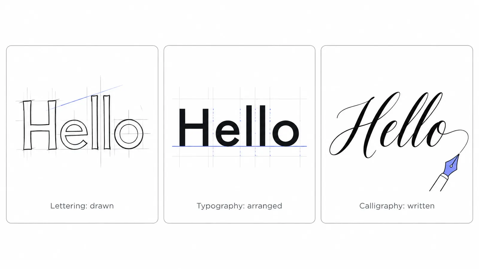
What is each discipline trying to do?
Typography: arranging type
Typography solves the problem of setting lots of text consistently. A type designer spends months making every letter work next to every other letter, so that a novel or an app interface reads evenly. The typographer then picks typefaces, sizes, spacing and line lengths. Good typography is often invisible.
Calligraphy: rhythm and the hand
Calligraphy is about rhythm and the hand. Its letterforms come from what a particular tool does naturally: a broad-edge nib held at a constant angle produces the thick and thin pattern of italic and blackletter, and a flexible pointed nib produces the swelling strokes of copperplate. Learning calligraphy means learning those motions until they are consistent.
Lettering: one composition
Lettering is about one composition. Because the letters are made for a single use, they can do things type cannot: interlock, follow a curve, swap a plain “e” for a looping one only where it looks best, or share a swash with the next word. Logos are the most visible example. The Coca-Cola wordmark is lettering based on Spencerian script, not a font you can install.
What tools do I need for each kind of lettering?
Tools for learning shapes
An HB or 2B pencil, a soft eraser, and smooth paper. Laser-printer paper or marker paper keeps brush pen tips from fraying.
Tools for inking hand lettering
Fine-liners in two or three sizes (around 0.1, 0.5 and 0.8 mm), a white gel pen for highlights, and a ruler.
Tools for brush lettering
Start with a small, firm-tipped brush pen, such as a Tombow Fudenosuke hard tip or a Pentel Fude Touch. Large soft tips like the Tombow Dual Brush look effortless in videos but magnify every wobble. Move on to round watercolour brushes later.
Tools for calligraphy
A straight or oblique pen holder with a pointed nib (Nikko G is a common first nib) and ink for copperplate-style scripts, or a broad-edge pen such as a Pilot Parallel for italic, uncial and blackletter.
Tools for digital lettering
A tablet with a pressure-sensitive stylus and an app that supports pressure brushes. To turn finished lettering into a scalable logo, letterers redraw or trace it as vectors in software like Adobe Illustrator, Affinity Designer or Inkscape.
What is the history of drawn and written letters?
The history below sticks to the milestones that shaped the styles people ask for today.
Blackletter and the first printed books
Blackletter grew out of the dense, angular book hands written across much of Europe from roughly the 12th century, and it came in several regional forms. When Johannes Gutenberg printed his Bible in Mainz in the 1450s, his type imitated textura, the formal blackletter of manuscript books. Type, in other words, began as a copy of calligraphy.
Blackletter faded from most of Europe as roman type spread, but in German-speaking countries its Fraktur branch stayed the everyday printing style into the 20th century. Germany’s Nazi government abruptly banned it in official use in 1941. Today blackletter mostly survives as a mood: newspaper mastheads, beer labels, diplomas, metal band logos and tattoos. The look people call “Old English” online is this family, and it is what Unicode Fraktur letters reproduce.
Copperplate and the business hand
From the 17th and 18th centuries, English writing masters developed round, sloped scripts written with flexible pointed pens. Engraved copybooks such as George Bickham’s The Universal Penman (published in parts in the 1730s and 1740s) spread the style, and because the models were engraved on copper plates, the script became known as copperplate. Its high contrast is the ancestor of most “elegant script” fonts used on wedding invitations.
Spencerian and Palmer: American cursive
In the mid-19th century Platt Rogers Spencer developed Spencerian script, a lighter, more ornamental business hand that was taught across the United States until the early 20th century. It was beautiful but slow. Austin Palmer’s Palmer Method, introduced in the 1890s, stripped the ornament away and trained writers to use arm movement for speed and endurance, and it dominated American classrooms for decades. The school cursive many adults learned belongs to this tradition of simplified American hands, taught through methods such as Zaner-Bloser and, from the late 1970s, D’Nealian.
If you want the letter-by-letter shapes of that school tradition, our cursive alphabet guides cover every capital and lowercase letter.
Sign painting
Before vinyl cutting machines and digital printing became common in the late 20th century, most shop signs, delivery vans and window displays were lettered by hand by professional sign painters. Their craft was lettering in the purest sense: drawing letters to fit a specific surface, at a specific size, to be read from a specific distance. Sign painters used long-haired lettering brushes called quills and liners, and a painted stroke vocabulary that brush letterers still borrow. Hand-painted signage has seen a revival since the 2010s, as businesses have sought out work that a vinyl plotter can’t imitate.
Modern brush lettering
Affordable Japanese brush pens and social media combined in the 2010s to create the style most people now picture when they hear “lettering”: bouncy, high-contrast script with thin upstrokes and heavy downstrokes. It borrows the pressure principle of pointed-pen calligraphy but relaxes the rules. Baselines bounce, letters vary in size, and flourishes are added for effect. It is the most approachable entry point into the craft, which is why the practice section below starts there.
Where do lettering generators fit?
The phrase “lettering generator” covers three technologies that behave very differently once you copy the result. Knowing which one you are using saves a lot of frustration.
| Approach | What you get | Survives copy and paste? | Any style possible? | Best for |
|---|---|---|---|---|
| Unicode text | Real characters that already look styled (𝓛𝓮𝓽𝓽𝓮𝓻𝓲𝓷𝓰, 𝔏𝔢𝔱𝔱𝔢𝔯𝔦𝔫𝔤) | Yes, it is plain text | No, only shapes Unicode has encoded | Bios, display names, captions, messages |
| Image | A PNG or SVG of text rendered in a real typeface | As a picture, not as text | Any font, colour, outline or shadow | Thumbnails, stickers, printables, story graphics |
| Installed font | Formatting applied inside one document or app | No, the style stays behind | Any font you install | Documents, slides, print design |
None of these is lettering in the strict sense, because nobody draws the letters for your piece. They are closer to typography: arranging letterforms that were designed in advance.
Unicode text
Unicode text is what the main cool lettering generator produces. It maps your letters onto alphabets that exist in the Unicode standard, mostly the Mathematical Alphanumeric Symbols block, so the “style” is part of the characters themselves. That is why it works in an Instagram bio, where you have no font menu. The limits are real: only the alphabets Unicode contains are available, some letters are missing, and screen readers handle the characters poorly. Our guide to how fancy text works explains the mechanics.
Image output
Image output is the right tool when you need a look Unicode can’t produce, such as a bubble letter with an outline and shadow. The Lettering Image Maker renders your words with real display typefaces and exports a PNG.
Installed fonts
Installed fonts are the answer for documents. If you want a cursive heading in Word or Google Docs, choose a script font there, as covered in how to type in cursive.
How do I start hand lettering?
Learn the guidelines first
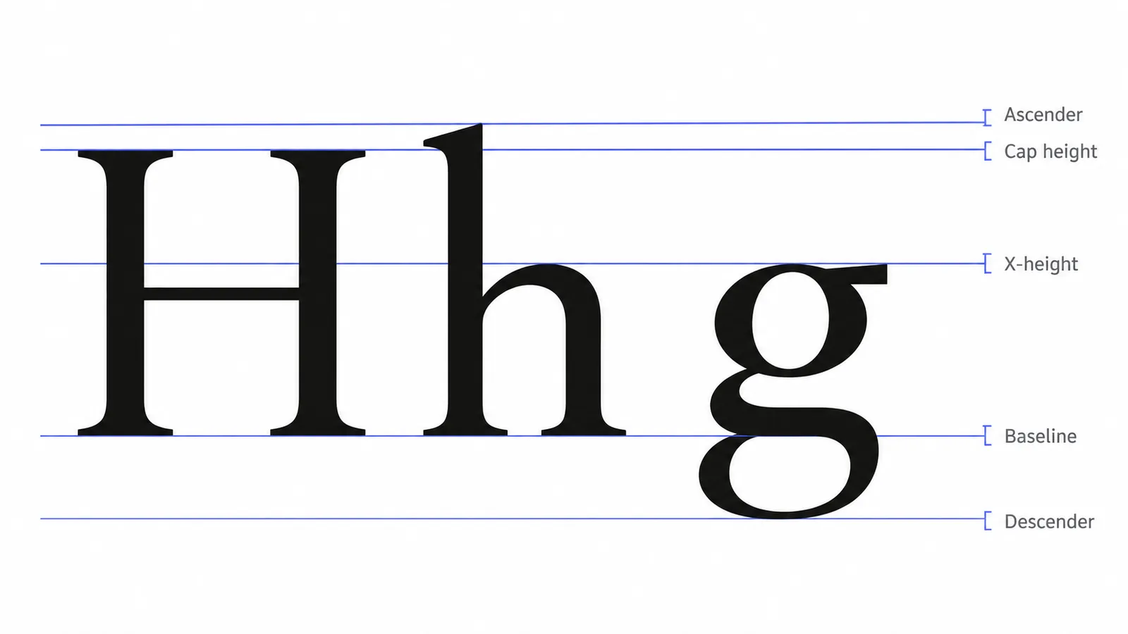
Every alphabet, drawn or typed, sits on a set of invisible horizontal lines. Drawing them in pencil before you letter is the single biggest improvement a beginner can make.
| Line | What sits on it | Example letters |
|---|---|---|
| Baseline | The bottom of most letters | Every letter rests here except the parts of g, j, p, q, y that drop below |
| X-height | The top of lowercase letters without ascenders | a, c, e, m, n, o, r, s, u, v, w, x, z |
| Cap height | The top of capital letters | A, H, M, T |
| Ascender line | The top of tall lowercase strokes, often slightly above cap height | b, d, f, h, k, l |
| Descender line | The bottom of strokes that drop below the baseline | g, j, p, q, y |
The ratio between x-height and cap height sets the personality of the lettering. A large x-height (lowercase nearly as tall as capitals) reads as friendly and modern. A small x-height with tall ascenders reads as formal and elegant, which is typical of copperplate. For brush lettering practice, a common starting point is an x-height of about 1 cm with ascenders and descenders the same height again.
Add slant lines too if you want consistent italic or script lettering. Rule light diagonal lines at your chosen angle (around 55° from horizontal is traditional for copperplate) and keep downstrokes parallel to them.
Practise the basic strokes
Brush and script lettering is built from a small set of strokes. Practise each one on its own, filling a line at a time, before you join them into letters.
- Upstroke: a thin hairline drawn upward with almost no pressure.
- Downstroke: a thick line drawn downward with full pressure. This is the core rule of brush lettering: thin up, thick down.
- Overturn: a thin upstroke that curves over into a thick downstroke, the arch of n and m.
- Underturn: a thick downstroke that curves into a thin upstroke, the bowl of u and the bottom of t.
- Compound curve: an overturn and underturn joined, as in the hump of n followed by its exit.
- Oval: an anticlockwise loop, thick on the left side and thin on the right, the basis of a, d, g, o, q.
- Ascending loop: a thin upstroke that loops back into a thick downstroke, as in b, h, k, l.
- Descending loop: a thick downstroke that loops back up thin, as in g, j, y.
Go slowly. Speed hides inconsistency, and most beginners shake because they try to draw strokes as fast as the videos they watched.
Once the strokes are steady, letters become combinations. An “a” is an oval plus an underturn. An “n” is a downstroke plus a compound curve. An “h” is an ascending loop plus a compound curve.
Faux calligraphy: brush lettering with any pen
Faux calligraphy imitates the look of brush lettering without a brush. It is the best way to learn where the weight goes before you have the pressure control.
- Write the word in a joined, monoline script with a fine pen.
- Find every downstroke: any part of a letter where your pen travelled downward.
- Draw a second line beside each downstroke, on the same side every time, usually the left of the stroke for a right-slanting script.
- Fill the gap between the two lines.
Done well, faux calligraphy is hard to tell from brush work at a glance, and it teaches the stroke logic that makes real brush lettering look right.
Compose a word, not just letters
Lettering differs from handwriting in that the whole word is designed. Before inking, check:
- Spacing: look at the space between letters, not the letters themselves. Round letters (o, c) need to sit closer to their neighbours than straight ones (l, i) to look evenly spaced.
- Consistency: the same slant, the same weight on every downstroke, loops of the same size.
- Hierarchy: in a phrase, choose one or two words to emphasise and keep the rest simpler.
- Flourishes last: add swashes only where there is empty space for them, typically on the first capital, a descender in the last line, or a crossbar on t.
Our cursive letter guides include printable practice sheets with guidelines already ruled, which are useful for drilling joins between letters.
What beginner mistakes should I avoid?
| Mistake | Why it happens | Fix |
|---|---|---|
| Thick upstrokes | Pressing the same on the way up and down | Say “thin up, thick down” aloud while you practise |
| Letters drifting off the baseline | No guidelines | Rule a baseline and x-height every time, even for a single word |
| Uneven slant | Writing from the wrist with the paper square to the desk | Turn the paper so your strokes run straight towards you |
| Frayed brush pen tip | Rough paper, or pushing the tip against its direction on upstrokes | Use smooth paper and pull the pen, never push it |
| Copying one style forever | Tracing only someone else’s alphabet | Once the basic strokes are steady, design your own variations of a few letters |
Lettering rewards patience more than talent. Ten minutes of basic strokes a day, with guidelines, will improve your letters faster than an hour of freehand words once a week.
So what is lettering in practice? It is the habit of drawing letters against guidelines and redrawing them until they fit the piece.
Frequently asked questions
Basics
What is lettering in simple words?
What is lettering vs typography, and which one is a font?
Is hand lettering the same as calligraphy?
Where it works
What is lettering in a logo, and is it a font?
What is the difference between a font and a typeface?
Why is it called Old English if it is blackletter?
How it works
Do I need a brush pen to start lettering?
What should I practise first when learning lettering?
Tips & limits
Is digital lettering on an iPad still lettering?
Is a lettering generator the same as lettering?
Related
- Cursive Alphabet: Letters A to ZHow to write every capital and lowercase letter in cursive, with printable practice sheets.
- Lettering Image MakerThis lettering generator draws your words in 16 display fonts, from bubble and graffiti to Old English and neon. Pick colours and effects, then download a sharp PNG.
- How Fancy Text Works (and Why It Isn't Really a Font)How do fancy fonts work? They are not fonts: copy-paste styles are separate Unicode characters, mostly made for mathematics, phonetics and East Asian typesetting. The style travels with the text, but missing letters and fallback fonts change the look.
- Cursive Text GeneratorThis cursive text generator turns your words into script-style Unicode letters for names, bios and captions. Type your text, tap Copy and paste it into Instagram, TikTok, Discord or a message.
- How to Type in Cursive on Any Device or AppHow to type in cursive depends on one choice: a cursive font, which only exists inside one document, or Unicode cursive characters, which stay cursive wherever you paste them. Use a font in Word and Docs, and Unicode on iPhone, Android and social apps.
- Fancy Text and Screen Readers: What Happens and What to DoAre fancy fonts accessible? Mostly not: styled Unicode letters are separate characters, so screen readers may read long character names or skip them. Wide text and native formatting fare best; upside-down, glitch and look-alike styles fare worst.