How Fancy Text Works (and Why It Isn't Really a Font)
How do fancy fonts work? They are not fonts: copy-paste styles are separate Unicode characters, mostly made for mathematics, phonetics and East Asian typesetting. The style travels with the text, but missing letters and fallback fonts change the look.
By Maya Chen, lettering designer and type educator · Checked by Jordan Hale · · Published · How we review content
Key facts
- Fancy text is not a font: each styled letter is a separate Unicode character, such as U+1D400 MATHEMATICAL BOLD CAPITAL A, while the plain word Hello is U+0048, U+0065, U+006C, U+006C, U+006F.
- The Mathematical Alphanumeric Symbols block, added in Unicode 3.1 in 2001 for scientific publishers, supplies the bold, italic, script, Fraktur, double-struck, sans-serif and monospace alphabets.
- Circled letters and fullwidth forms come from East Asian character sets, while small caps and superscripts come from phonetic alphabets such as the IPA.
- Script, Fraktur and double-struck alphabets have holes filled by older Letterlike Symbols characters, such as U+210E PLANCK CONSTANT for the italic h.
- Unicode has subscript forms for only 17 Latin letters, and script and Fraktur digits do not exist.
- NFKC normalization folds bold, italic, script, Fraktur, circled, squared and fullwidth letters back to plain ones, but not small caps, upside-down text or negative squared letters.
How do fancy fonts work? Take one styled word apart
Fancy fonts work by swapping each letter for a different Unicode character that looks like a styled letter. Paste 𝓗𝓮𝓵𝓵𝓸 into a tool that shows code points and you will see five characters, none of which is a normal letter:
| You see | Code point | Official Unicode name |
|---|---|---|
| 𝓗 | U+1D4D7 | MATHEMATICAL BOLD SCRIPT CAPITAL H |
| 𝓮 | U+1D4EE | MATHEMATICAL BOLD SCRIPT SMALL E |
| 𝓵 | U+1D4F5 | MATHEMATICAL BOLD SCRIPT SMALL L |
| 𝓵 | U+1D4F5 | MATHEMATICAL BOLD SCRIPT SMALL L |
| 𝓸 | U+1D4F8 | MATHEMATICAL BOLD SCRIPT SMALL O |
The plain word “Hello” is U+0048, U+0065, U+006C, U+006C, U+006F. The styled version is not “Hello with formatting”. It is a different string of characters that happens to look like a cursive “Hello”.
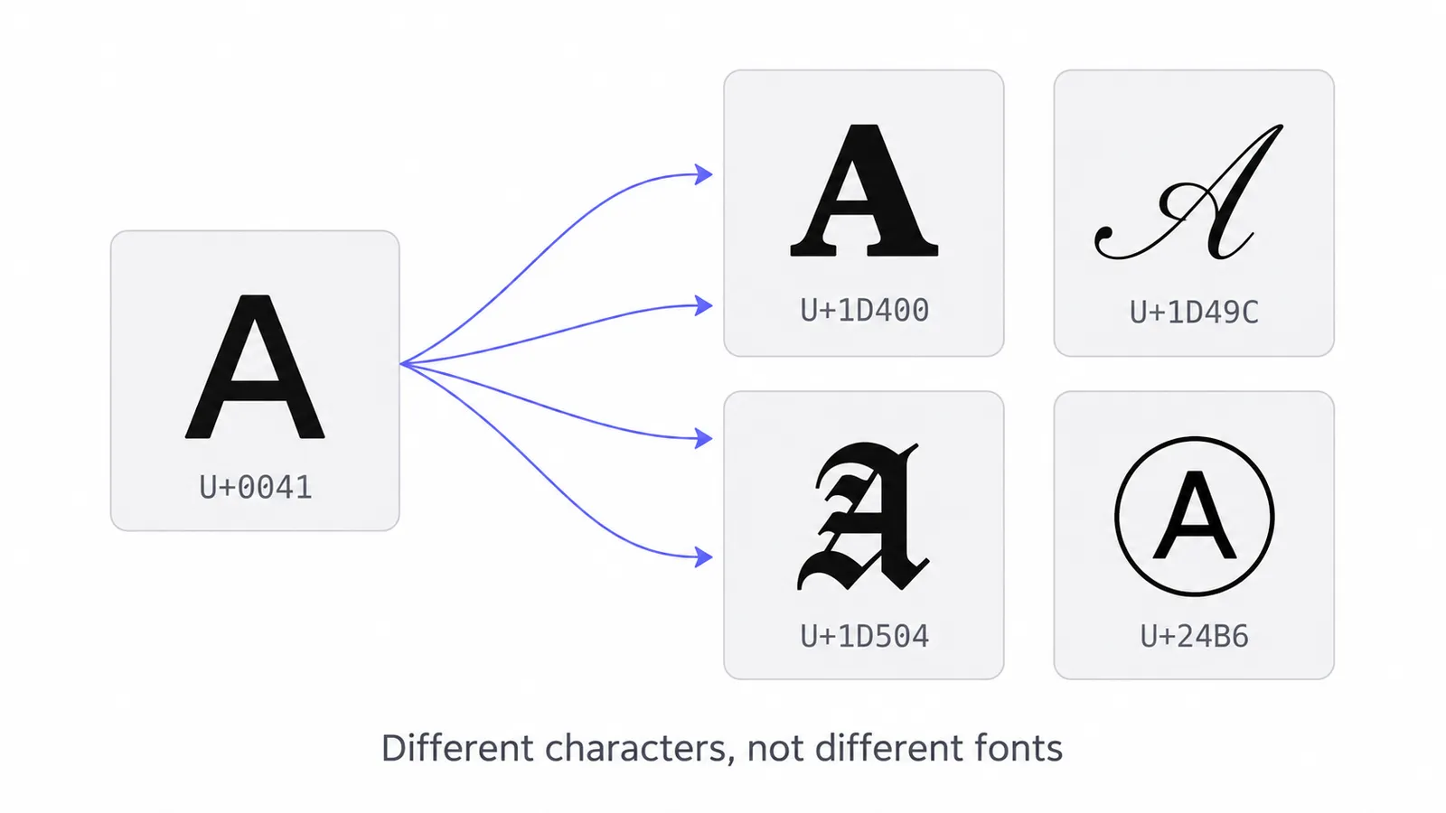
That single fact explains everything else in this guide: why styled text survives copy and paste, why it works in places with no font menu, why it uses more of some character limits, why screen readers stumble over it, and why it occasionally appears as boxes.
What is the difference between characters, glyphs and fonts?
A character is a numbered unit of text, a glyph is the picture that draws it, and a font is the file that links the two. Three terms do the heavy lifting:
- A character is an abstract unit of text with a number, called a code point. Unicode assigns them. “LATIN CAPITAL LETTER A” is U+0041 everywhere in the world.
- A glyph is the picture used to draw a character. The A in Times New Roman and the A in Arial are different glyphs for the same character.
- A font is a file full of glyphs, plus a table saying which glyph draws which code point.
Normal formatting (bold in Word, a font chosen in Canva) changes the glyph while keeping the character. When you copy text out of that document into a messaging app, only the characters travel, so the bold disappears.
Fancy text works the other way round. It keeps whatever glyph style the device prefers but changes the character. Because a bold character is still a bold character on the receiving device, the style travels with the text. The trade-off is that you can only use styles that exist as characters, and the receiving device needs a font that has a glyph for them.
Why do these styled alphabets exist?
They exist for mathematics, phonetics and East Asian compatibility, not for decoration. Unicode’s stated goal is to encode characters, not styles. Its own technical report on mathematics (UTR #25) says the mathematical letters are not meant for styling ordinary text. So why do they exist? Each family has a specific, practical origin.
Mathematical letters: style that carries meaning
In mathematics and physics the style of a letter changes what it means. A bold v may be a vector while an italic v is a scalar. Script ℒ is often used for a Lagrangian, Fraktur 𝔤 for a Lie algebra, and double-struck ℝ for the real numbers. If a mathematical paper loses its formatting, its meaning changes. So in 2001 (Unicode 3.1), at the request of scientific publishers, Unicode added the Mathematical Alphanumeric Symbols block: complete Latin alphabets in bold, italic, bold italic, script, bold script, Fraktur, bold Fraktur, double-struck, sans-serif (in four weights and slants) and monospace, plus bold Greek and several sets of digits.
These alphabets are the backbone of almost every copy-paste generator. Bold, italic, cursive, gothic, outline and typewriter styles all come from here.
Letterlike Symbols: the older pieces
Some of those letters had already been encoded in the early 1990s in the Letterlike Symbols block, because they were common standalone symbols: ℋ for the Hamiltonian, ℎ for Planck’s constant, ℜ and ℑ for the real and imaginary parts of a complex number, ℕ ℤ ℚ ℝ ℂ for number sets. Unicode’s rule is never to encode the same character twice, so when the full maths alphabets arrived, those positions were left empty and the older characters were designated as the official members. That is the source of the “holes” covered below.
Enclosed alphanumerics: legacy Asian character sets
Circled letters ⓐ, parenthesized letters ⒜ and circled numbers ① came into Unicode from East Asian national character sets, where they were used for numbered lists, annotations and form labels. Unicode included them so that text in those older encodings could be converted without losing anything. Squared and negative squared letters (🄰, 🅰) were added later in the Enclosed Alphanumeric Supplement, largely for compatibility with Japanese broadcast and mobile-phone symbol sets, which is also why a few of them (🅰 🅱 🅾 🅿) became emoji.
Fullwidth forms: Latin letters sized for CJK text
Chinese, Japanese and Korean characters each occupy a square cell. East Asian computer systems included Latin letters drawn the same width as an ideograph so that mixed text lined up in a grid. Unicode kept these as the Halfwidth and Fullwidth Forms block. Outside that context they look stretched, which is the whole appeal of the vaporwave aesthetic.
Small caps and superscripts: phonetics
Linguists need symbols for sounds the Latin alphabet doesn’t distinguish. The International Phonetic Alphabet uses several small capitals as separate letters: ʀ for a uvular trill, ɴ for a uvular nasal, ʟ for a velar lateral, ɪ and ʏ for particular vowels. More small capitals come from the Uralic Phonetic Alphabet, in the Phonetic Extensions block. Superscript letters such as ʰ (aspiration) and ʷ (labialisation) mark details of pronunciation.
Generators borrow these to build “small caps” and “tiny text”. Because they were never designed as a complete alphabet, the sets are incomplete.
Combining marks: accents that stack
A combining mark is a character that attaches to the character before it. Unicode has them so that any letter can carry any accent: “é” can be stored either as the single character U+00E9 or as “e” followed by U+0301 COMBINING ACUTE ACCENT. Strikethrough and underline styles exploit this by adding U+0336 COMBINING LONG STROKE OVERLAY or U+0332 COMBINING LOW LINE after every letter. Glitch (“Zalgo”) text piles dozens of marks above and below each letter.
Look-alike letters from other scripts
Styles such as 卂丂丨卂几, ᗩᗷᑕ or ꍏꌃꏳ aren’t Latin at all. They are real letters and syllables from Chinese, Canadian Aboriginal syllabics, Yi and other writing systems, picked because their shapes resemble Latin letters. To a reader of those languages, the result is gibberish or, occasionally, an unintended word.
Which Unicode blocks do fancy fonts come from?
Eleven blocks supply nearly all copy-paste styles, led by Mathematical Alphanumeric Symbols.
| Block | Range | What generators take from it | Example |
|---|---|---|---|
| Mathematical Alphanumeric Symbols | U+1D400–1D7FF | Bold, italic, script, Fraktur, double-struck, sans-serif, monospace letters and digits | 𝐁 𝑰 𝓢 𝔊 𝔻 𝗦 𝚃 |
| Letterlike Symbols | U+2100–214F | The letters missing from the maths block | ℬ ℯ ℌ ℝ ℎ |
| Enclosed Alphanumerics | U+2460–24FF | Circled and parenthesized letters, circled numbers | ⓐ Ⓑ ⒞ ① |
| Enclosed Alphanumeric Supplement | U+1F100–1F1FF | Squared, negative squared, negative circled letters, regional indicators | 🄰 🅰 🅐 🇦 |
| Halfwidth and Fullwidth Forms | U+FF00–FFEF | Wide (vaporwave) letters, digits and punctuation | A b 3 ! |
| IPA Extensions | U+0250–02AF | Small caps ʙ ʜ ɪ ʟ ɴ ʀ ʏ, upside-down letters ɐ ǝ ɹ | ʜ ɐ |
| Phonetic Extensions (and Supplement) | U+1D00–1D7F (U+1D80–1DBF) | Most small caps, modifier (superscript) letters | ᴀ ᴍ ᴬ ᵇ |
| Latin Extended-D | U+A720–A7FF | Small caps ꜰ and ꜱ | ꜰ ꜱ |
| Spacing Modifier Letters | U+02B0–02FF | Superscripts ʰ ʲ ʳ ʷ ʸ ˡ ˢ ˣ | ʰ ˢ |
| Superscripts and Subscripts | U+2070–209F | Superscript and subscript digits, ⁱ ⁿ, subscript letters | ⁱ ⁿ ₐ ² |
| Combining Diacritical Marks | U+0300–036F | Strikethrough, underline, overline, glitch marks | S̶ U̲ |
The names and ranges come from Unicode’s Blocks.txt. You can see every letter of the alphabet in each of these styles on our alphabet in different fonts pages.
Why do some fancy font styles have missing letters?
There are two reasons: older characters fill some slots, and some letters were never encoded.
Holes filled by older characters
When a letter already existed in Letterlike Symbols, the maths block left its slot permanently unassigned. A generator has to reach outside the block to fill it:
| Style | Letters taken from Letterlike Symbols |
|---|---|
| Script (cursive) | ℬ ℰ ℱ ℋ ℐ ℒ ℳ ℛ ℯ ℊ ℴ |
| Fraktur (gothic) | ℭ ℌ ℑ ℜ ℨ |
| Double-struck (outline) | ℂ ℍ ℕ ℙ ℚ ℝ ℤ |
| Italic | ℎ (U+210E PLANCK CONSTANT) |
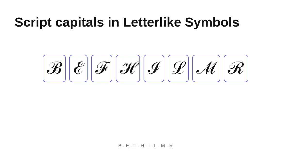
The letters display fine, but a font may draw the older block in a slightly different style from the maths block, so in some fonts the script word ℋℯ𝓁𝓁ℴ looks uneven. The bold versions (bold script, bold Fraktur) were added all at once and have no holes, which is one reason 𝓗𝓮𝓵𝓵𝓸 looks more consistent than ℋℯ𝓁𝓁ℴ.
Letters that were never encoded
Some alphabets simply don’t exist in full, because nobody needed them for phonetics or maths:
- Small caps: there is no small-capital X. A small-capital Q (ꞯ, U+A7AF) was only added in Unicode 11 in 2018, and few fonts include it yet, so generators usually substitute ǫ, as ours does.
- Superscripts: a superscript q (U+107A5) only arrived in Unicode 14 in 2021. Font support is thin, so generators commonly use the look-alike ᑫ, a Canadian syllabic character.
- Subscripts: Unicode has subscript forms for only 17 Latin letters (a, e, h, i, j, k, l, m, n, o, p, r, s, t, u, v, x). Letters such as b, c, d, f and g have no subscript at all.
- Squared, negative squared and black circled letters exist only as capitals.
- Script and Fraktur digits don’t exist. Only bold, double-struck, sans-serif (regular and bold) and monospace digits do.
Can machines read fancy text as normal text?
Often, but not always. Unicode defines compatibility decompositions: an official statement that a character is a styled variant of another. A process called NFKC normalization applies them, turning 𝐇 back into H. Search systems and username checks can use NFKC to treat look-alike strings as equal. Here is what NFKC does to “Hello” in each style (computed with Python’s unicodedata module):
| Style | Example | After NFKC |
|---|---|---|
| Bold, italic, script, Fraktur (including ℌ ℯ) | 𝐇𝐞𝐥𝐥𝐨 | Hello |
| Circled | ⓗⓔⓛⓛⓞ | hello |
| Squared | 🄷🄴🄻🄻🄾 | HELLO |
| Fullwidth | Hello | Hello |
| Superscript | ᴴᵉˡˡᵒ | Hello |
| Parenthesized | ⒣⒠⒧⒧⒪ | (h)(e)(l)(l)(o) |
| Negative squared | 🅷🅴🅻🅻🅾 | unchanged |
| Negative circled | 🅗🅔🅛🅛🅞 | unchanged |
| Small caps | ʜᴇʟʟᴏ | unchanged |
| Strikethrough, underline | H̶e̶l̶l̶o̶ | unchanged (the marks remain) |
| Upside-down | ollǝH | unchanged |
Small caps don’t fold because, in Unicode’s view, ʀ is a distinct phonetic letter rather than a styled R. Negative squared letters are treated as symbols. Whether a given platform or search engine actually applies NFKC isn’t publicly documented, so treat this table as “what is possible”, not as a promise. If you need to turn styled text back into plain letters yourself, the unstyle tool covers the styles NFKC misses.
Why does fancy text look different on every device?
Because no single font contains every Unicode character, so operating systems use font fallback. When the current font has no glyph for a character, the system walks through a list of other installed fonts until it finds one that does.
For a string like 𝓗𝓮𝓵𝓵𝓸 that usually means:
- The app’s chosen font (for example the platform’s interface font) has no glyph for U+1D4D7.
- The system falls back to a font with maths coverage. On Windows this is typically Cambria Math or Segoe UI Symbol. On Android it is usually a member of Google’s Noto family. Apple devices draw from Apple’s own system fonts.
- That fallback font’s designer decided what a “mathematical bold script H” looks like.
So the script you see on an iPhone and the script your friend sees on a Samsung phone are drawn by different type designers, with different slants, loop sizes and weights. The characters are identical; the glyphs are not. This is also why styled text can look slightly heavier or lighter than the plain text around it, and why its line height sometimes jumps.
When the fallback list runs out without finding a glyph, the system draws a placeholder, usually an empty rectangle. That is the “tofu” box, covered in detail in why fancy text shows boxes.
What does this mean when I use fancy text?
Choose widely supported blocks, expect extra characters to be counted, and keep meaning in plain text.
- Pick styles from widely supported blocks for anything important. The maths alphabets, circled letters and fullwidth forms display on nearly every current device.
- Expect more characters to be counted. Because the styled characters live high in Unicode, many platforms count them as two. The character limits guide has the numbers.
- Keep meaning in plain text. A screen reader may announce “mathematical bold script capital H” for each letter. Our accessibility guide explains what to do instead.
- Use an image when the look matters more than the text. If you need a typeface Unicode doesn’t have, render it as a picture.
So, how do fancy fonts work? They swap your letters for look-alike characters that already exist in Unicode, and every limit above follows from that.
Frequently asked questions
Basics
Why can't I get any font I want with a fancy text generator?
When were the mathematical letters added to Unicode?
How do fancy fonts work?
Where it works
Why does fancy text look different on my friend's phone?
Where do circled and wide letters come from?
How it works
What is the Unicode name of a bold letter?
Can I convert fancy text back to normal text?
Why are some letters missing from fancy text styles?
Tips & limits
Are fancy text generators safe to use?
Related
- Fancy Letters A to ZEvery letter of the alphabet in every Unicode style, with code points.
- Convert Fancy Text Back to Plain TextConvert fancy text to normal here: paste bold, cursive, gothic, bubble or small caps text and the plain letters appear instantly, ready to edit, search for or read aloud.
- Why Fancy Text Shows Boxes, Question Marks or Nothing at AllWhy do fancy fonts show boxes? The device showing the text has no font for that character, so it draws a placeholder; the text is not broken. Learn the symptoms, the riskiest styles, how app filtering differs, and how to test before posting.
- Fancy Text and Screen Readers: What Happens and What to DoAre fancy fonts accessible? Mostly not: styled Unicode letters are separate characters, so screen readers may read long character names or skip them. Wide text and native formatting fare best; upside-down, glitch and look-alike styles fare worst.
- Character Limits for Bios, Names and Posts, and How Fancy Text CountsThe Instagram bio character limit is 150 characters; X allows 280 weighted characters per post, TikTok 80 in a bio and Discord 190 in About Me. Styled letters can count double, so a five-letter word can cost 5, 7, 10 or 20.
- What Is Lettering? How It Differs From Calligraphy and TypographyWhat is lettering? It is drawing letters for one specific piece, unlike calligraphy, which writes letters in strokes, and typography, which arranges ready-made type. Here is what each term means, the tools, the history, and how to start drawing letters.